Healthy Path Co
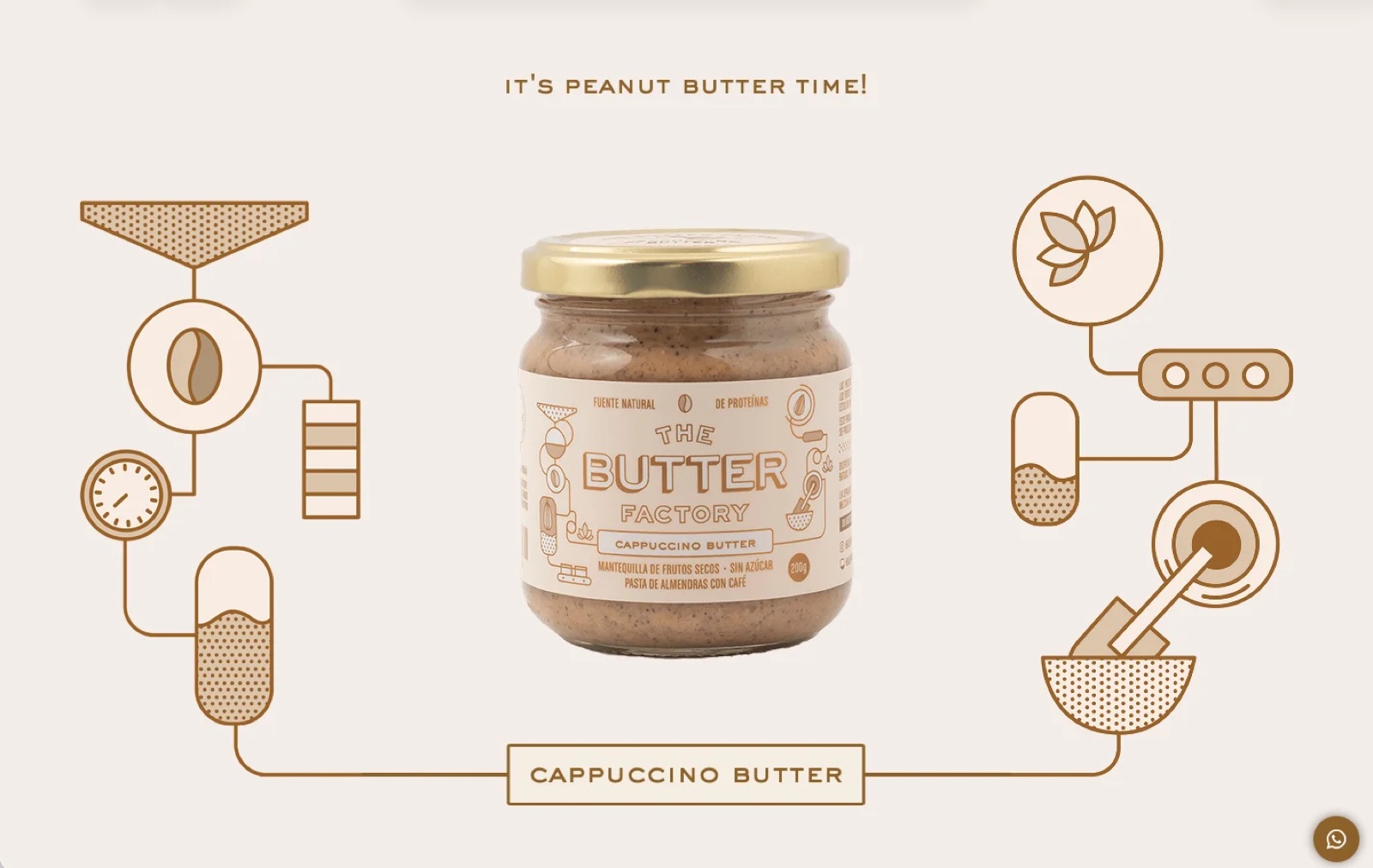
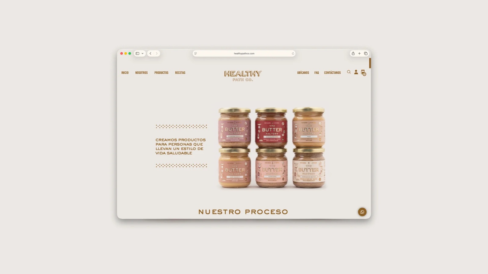
Healthy Path Co makes nut butters, jams, and superfoods for people building a healthier lifestyle, sold through more than 100 points of sale across Peru. This was Fibra Studio’s first full website — illustration and brand art by Fibra Studio, built around hand-drawn motion that had to hold up on every screen, all the way through checkout.
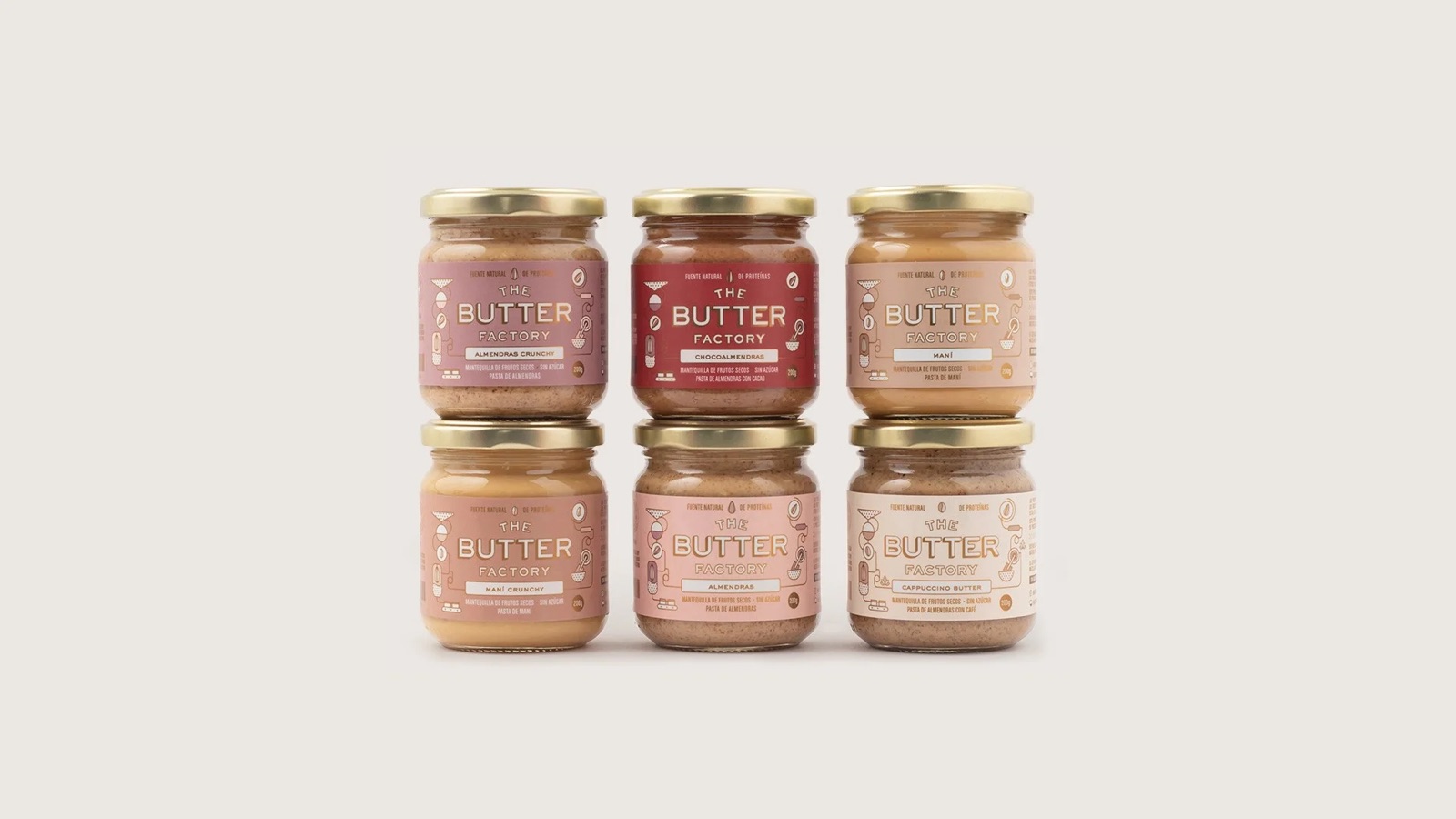
SUMMARY
- The challenge: carry Fibra Studio’s illustrations and brand art across every screen size, and extend that same visual identity all the way through checkout.
- My role: UX strategy and UI design of the checkout flow. (Illustration and visual art: Fibra Studio.)
- The result: a purchase flow that keeps Fibra Studio’s illustrated world intact, instead of dropping into a generic payment template the moment someone’s ready to buy.
THE PROBLEM
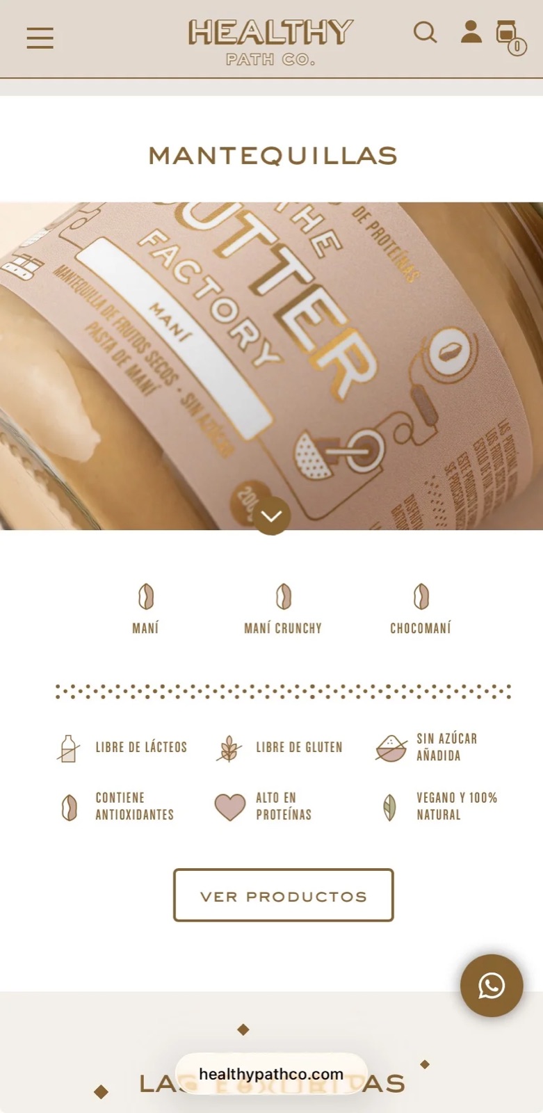
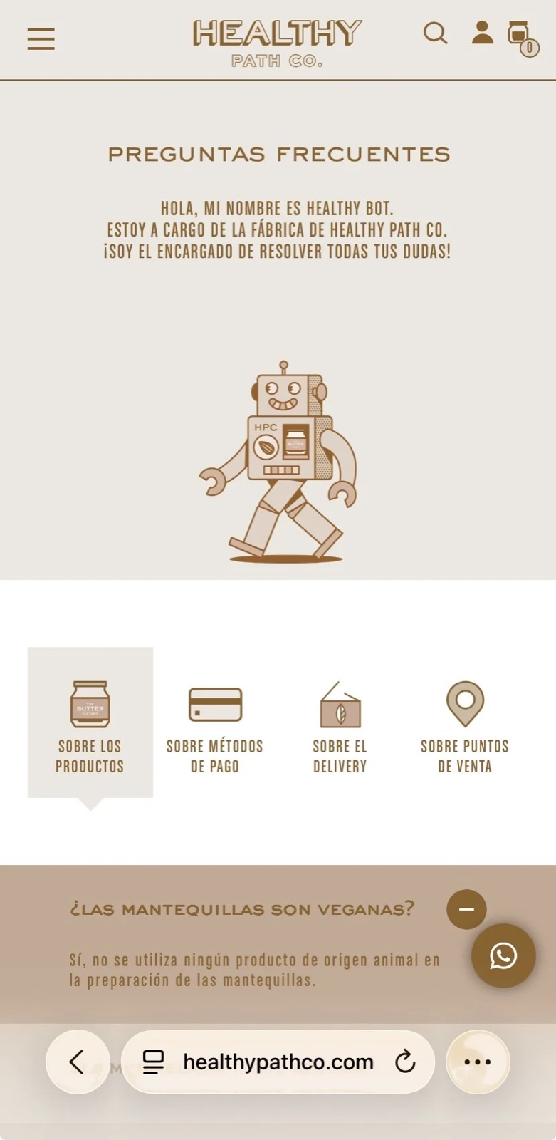
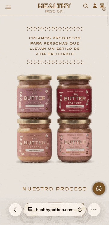
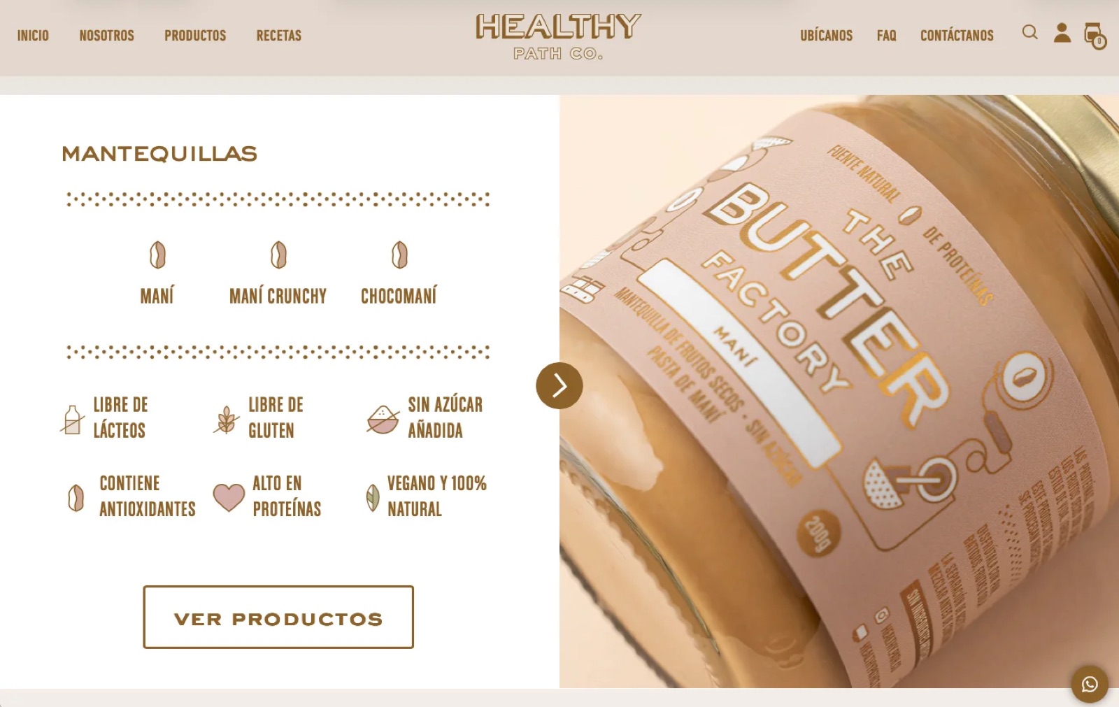
This was Fibra Studio’s first website, and the ambition was real: hand-drawn illustrations and motion, built by Fibra’s art team, telling the product’s story instead of just product photos. My part of the challenge was making that illustrated world hold up on a phone screen without breaking, slowing the page down, or flattening into something generic — all the way into checkout, where most e-commerce sites quietly drop the brand for a generic template.
THE SOLUTION
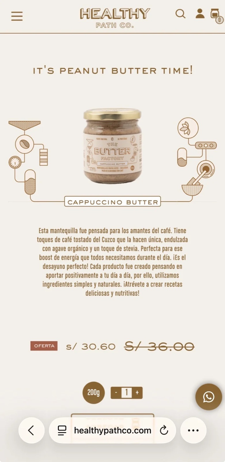
I adapted Fibra’s illustrations and motion to scale correctly across devices, then extended that same visual language into the checkout flow I designed — so buying a jar of peanut butter feels like part of the same story as browsing for it, not a jump into someone else’s template.