Carati
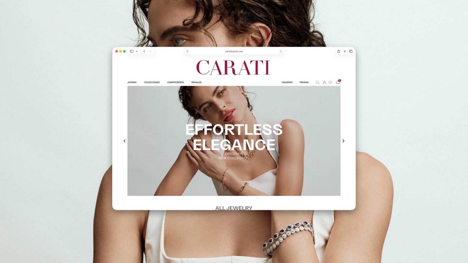
For over 40 years, Carati has made jewelry that reflects Peruvian tradition and modern craftsmanship, with physical stores across Lima and Trujillo.

SUMMARY
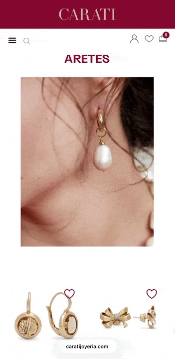
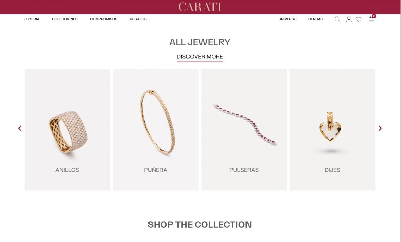
- The challenge: adapt the purchase flow for mobile, surface the brand’s physical stores, and organize jewelry by occasion instead of just by product type.
- My role: UX and UI design.
- The result: a mobile checkout that actually works, a store locator people can find, and a “shop by occasion” structure that matches how people actually buy jewelry.
THE PROBLEM
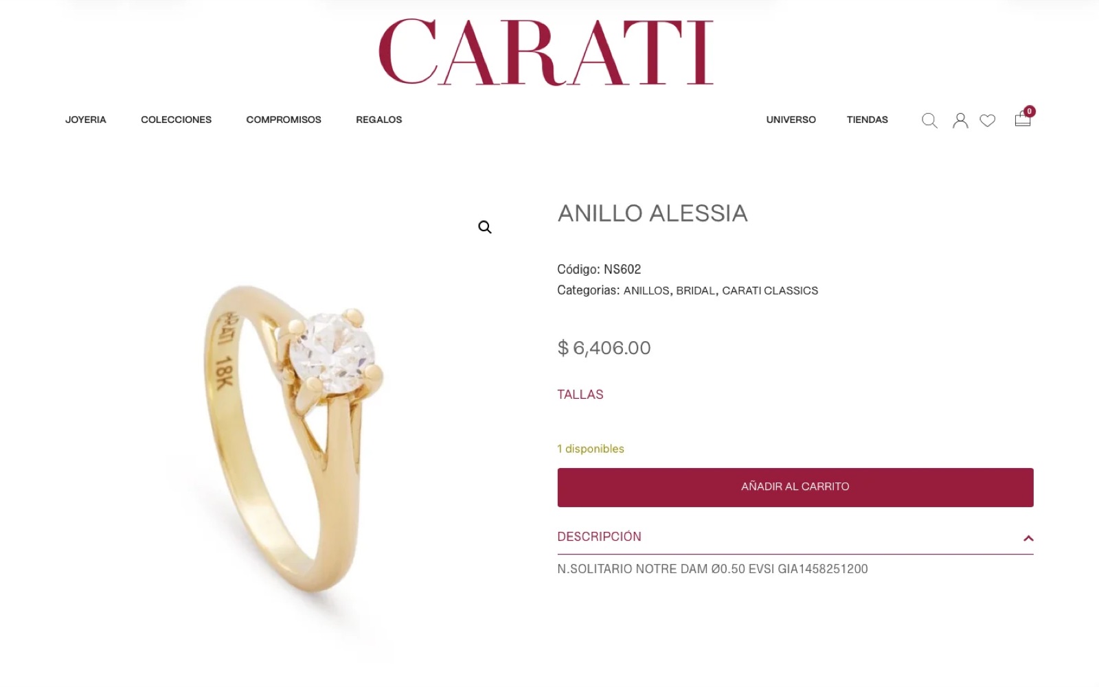
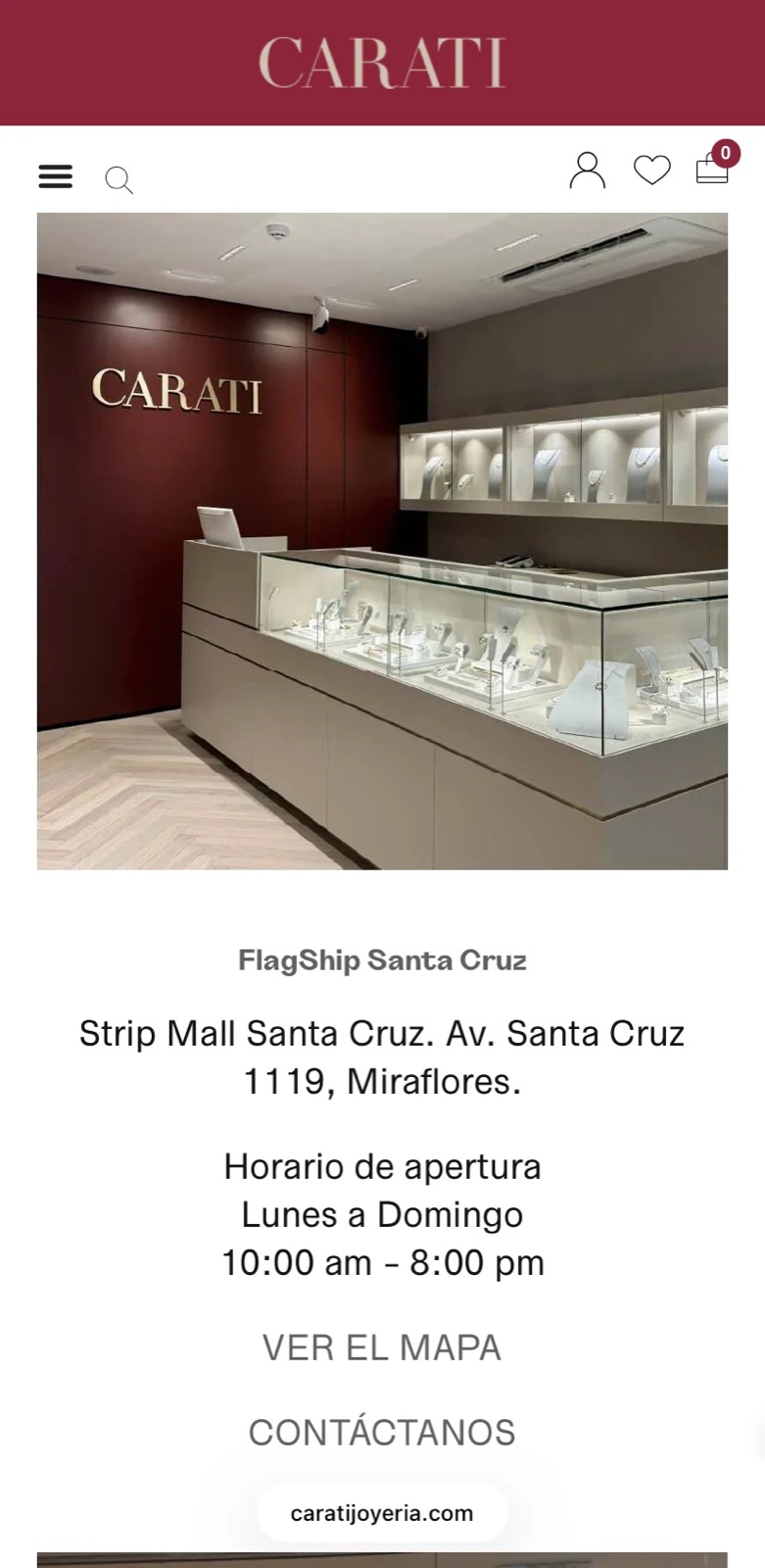
Most jewelry sites are organized by product — rings, earrings, necklaces — which works if you already know what you want. But jewelry is often bought as a gift, for a specific moment: a graduation, an anniversary, a baptism. The old structure made someone shopping for “something for my mom” dig through categories built for someone who already knew they wanted a bracelet. On top of that, checkout wasn’t built for mobile, and Carati’s six physical stores — a real part of its 40-year presence — were hard to find from the site.
THE SOLUTION
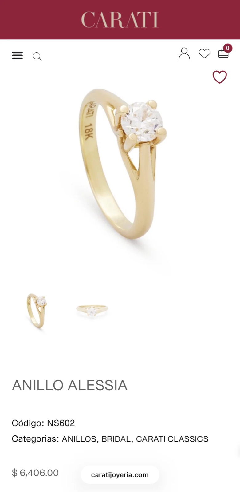
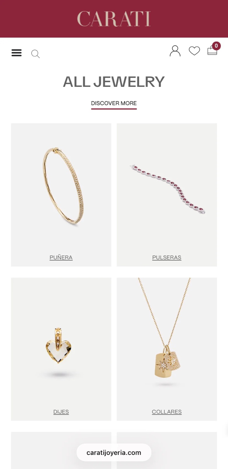
We rebuilt the purchase flow to work properly on a phone, added a clear path to the six physical stores, and introduced a second way to browse: by occasion, not just by product. Now someone shopping for a graduation gift or an anniversary finds a curated set immediately, instead of filtering through every ring in the catalog.